Prompt Description

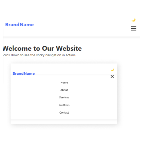
An AI Code Prompt for generating a responsive website menu is a game-changer for developers looking to streamline their workflow. Instead of manually coding a navigation bar from scratch, this AI-driven approach enables coders to generate a fully functional menu in seconds. The prompt ensures that the generated menu is responsive, adapting seamlessly to different screen sizes, from desktops to mobile devices. It incorporates HTML, CSS, and JavaScript to provide a smooth user experience with features like dropdowns, animations, and dark/light mode toggling. By leveraging AI, developers can significantly reduce development time while maintaining a high standard of design and functionality.
For coders, this AI Code Prompt is especially beneficial in speeding up prototyping and development. Whether working on personal projects or large-scale web applications, developers can use AI-generated code as a foundation, customizing it according to their specific needs. The prompt helps beginners understand structured code while allowing experienced developers to focus on higher-level customizations rather than repetitive coding tasks. By utilizing AI for code generation, coders can enhance efficiency, ensure best practices in modern web design, and create dynamic, user-friendly menus with minimal effort.
Steps to Generate a Responsive Website Menu using AI Code Prompt
1.Access Claude AI
- Open Claude AI in your browser (via Anthropic’s website or an integrated AI tool).
2.Copy Prompt
- Sign in / Register to Copy the Prompt
3.Input the Prompt
- Copy and paste the prompt into Claude AI’s chat interface and submit the request.
4.Review the Generated Code
- Claude will generate HTML, CSS, and JavaScript code.
- Carefully review the structure, styles, and functionality to ensure it meets your needs.
5.Copy and Implement the Code
- Copy the provided code and paste it into your code editor (VS Code, Sublime Text, etc.).
6.Test the Menu in a Browser
- Open the file in a browser and check responsiveness by resizing the window.
7.Customize and Optimize
- Modify colors, fonts, animations, or additional features as needed.
- Ensure SEO and accessibility best practices are followed.
8.Deploy Your Website
- Once satisfied, upload the menu code to your website or hosting server.