This Code generation AI prompt enables the creation of a responsive sidebar menu that serves as a sleek, modern navigation solution. Initially displaying only icons, the menu expands on hover to reveal labels, offering an intuitive user experience. Built with HTML5, CSS3, and JavaScript, it features smooth animations and transitions while maintaining a minimal footprint on the interface. The sidebar includes essential functionalities such as hover expansion, dark/light mode toggling with localStorage persistence, mobile responsiveness with a hamburger menu toggle, and an innovative auto-hide feature that keeps the interface clutter-free while ensuring accessibility.
With this Code generation AI prompt, developers can implement CSS variables for easy customization and integrate accessibility features like keyboard navigation support. FontAwesome icons enhance the visual appeal, representing key sections such as Home, Blog, About, Contact, and Settings. The sidebar adapts seamlessly to different screen sizes, collapsing completely on mobile devices until toggled. With subtle visual feedback on hover, it ensures a user-friendly and aesthetically pleasing navigation experience, making it a versatile and production-ready solution.
Humanize 174 words
Prompt Text
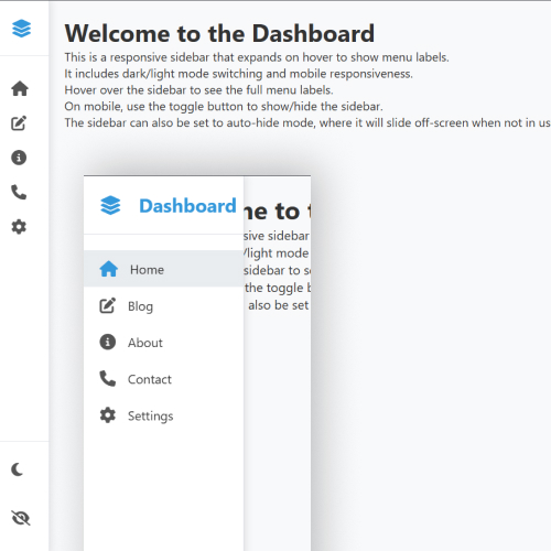
Generate a fully responsive sidebar menu that initially displays a minimal interface but expands to show menu labels on hover. The sidebar should be positioned on the left side of the screen with a sleek, modern design. It should include smooth animations, transitions, and a user-friendly experience.
Key Features:
Hover Expansion – When hovered over, the sidebar smoothly expands to reveal the menu labels.
Minimal Design – Initially, only display compact sections for navigation like Home, Blog, About, Contact, and Settings.
Smooth Animations – Ensure a fluid transition effect when expanding and collapsing.
Dark and Light Modes – Implement a color scheme switcher for light and dark UI.
Mobile Responsiveness – The menu should adjust properly for smaller screens.
Customizable Styling – Use CSS or Tailwind classes for easy styling and modifications.
Example Sections:
Home
Blog
About
Contact
Settings
Additional Requirements:
Implement auto-hide functionality so the sidebar can be configured to disappear when not in use.
Add smooth hover effects for better user experience.
Use CSS variables for easy customization of colors and dimensions.
Ensure proper functioning on mobile devices with a toggle button.
Include both light and dark mode with persistent preference saving.
Use a semantic HTML structure for better accessibility.